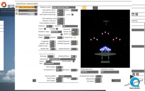
the WEAPON MANAGER!
- August 12, 2014
- mathilde
- DEVELOPMENT
- No Comments
Wow, at last, we were able to work on the most exciting part (well, for me ;) of the tool : the Weapon Manager! This manager is fun to use because it is super visual!
the WEAPON MANAGER or THE GOOD WAY OF WORKING?
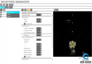
I have been working on the design of the Weapons Manager because this window was a little “crowded”, I admit.
. What a mess!
First of all… But what is the WeaponsManager ?
The Weapon Manager can help the user to create their weapons and the behavior of their bullets. This is a big window with lots of options!
. clean/organize!
So I have tried to clean it up, organize the options and make it understandable.
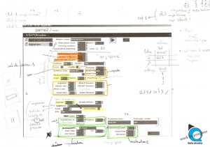
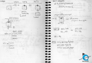
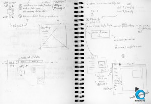
For this kind of task, the first thing to do is, I think, go meet the programmer and work with him with a piece of paper and a pencil.
. prototype!
Then, prototype with a graphic Software.
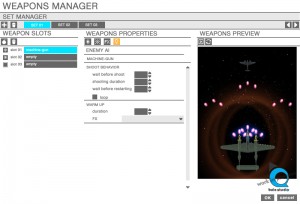
Now, I have tabs instead of all the options on the same page.
I really don’t know if this is the best way to organize the options in the window… Because maybe people won’t pay attention at the tabs and will miss lots of properties… I’ll see…
BUT… Next day, after sleeping well…
I wasn’t very satisfied with the last new version. All the ideas were there, but, the organization of the properties were a little messy, not intuitive again.
I have worked on it again. Grrr!
Working on the UI takes time, papers and pencils, meetings… because usability and ergonomic are very very important, well we are working on a tool, so this if the main rule about designing properties and options!
So, the new and last Weapon Manager now just bellow!




No Comments